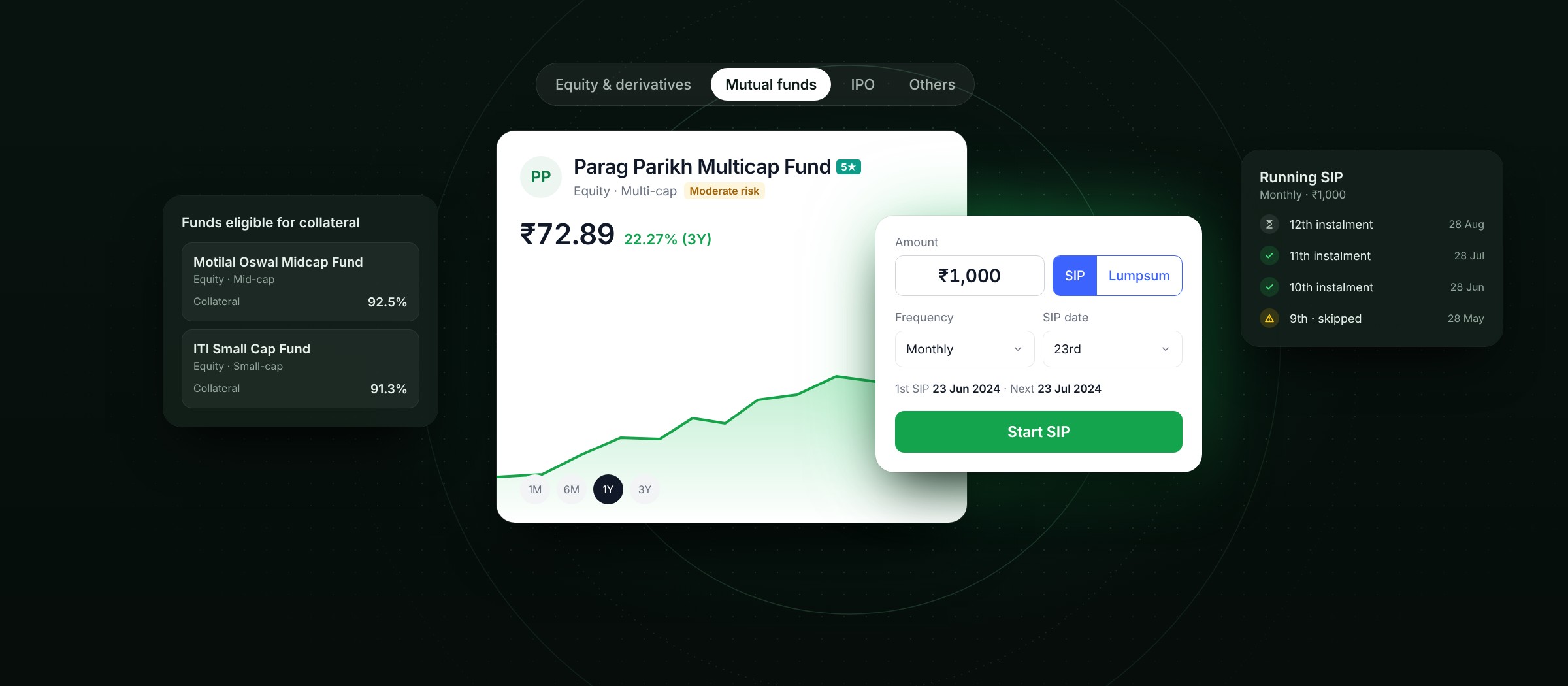
FYERS's websites looked like every other trading platform in India. On a team of three, I helped rebuild the websites of two FYERS businesses, FYERS Securities and FYERS Asset Management, and designed a design system for each end to end, so both read as premium and made for serious traders.
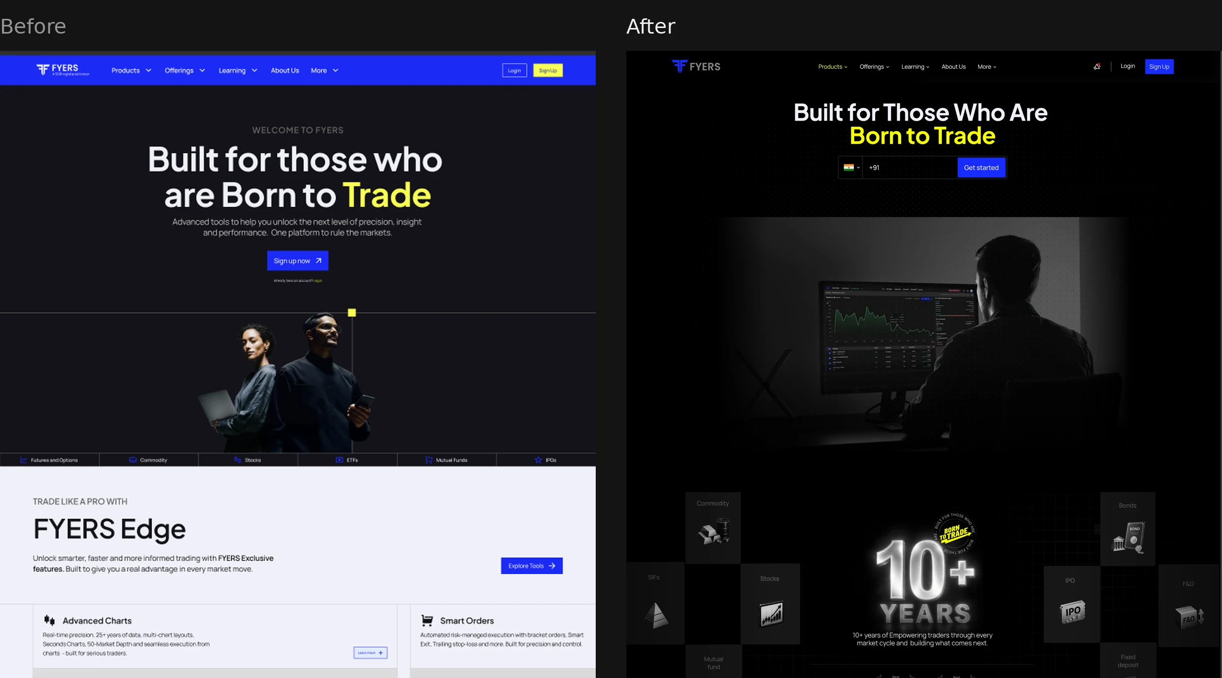
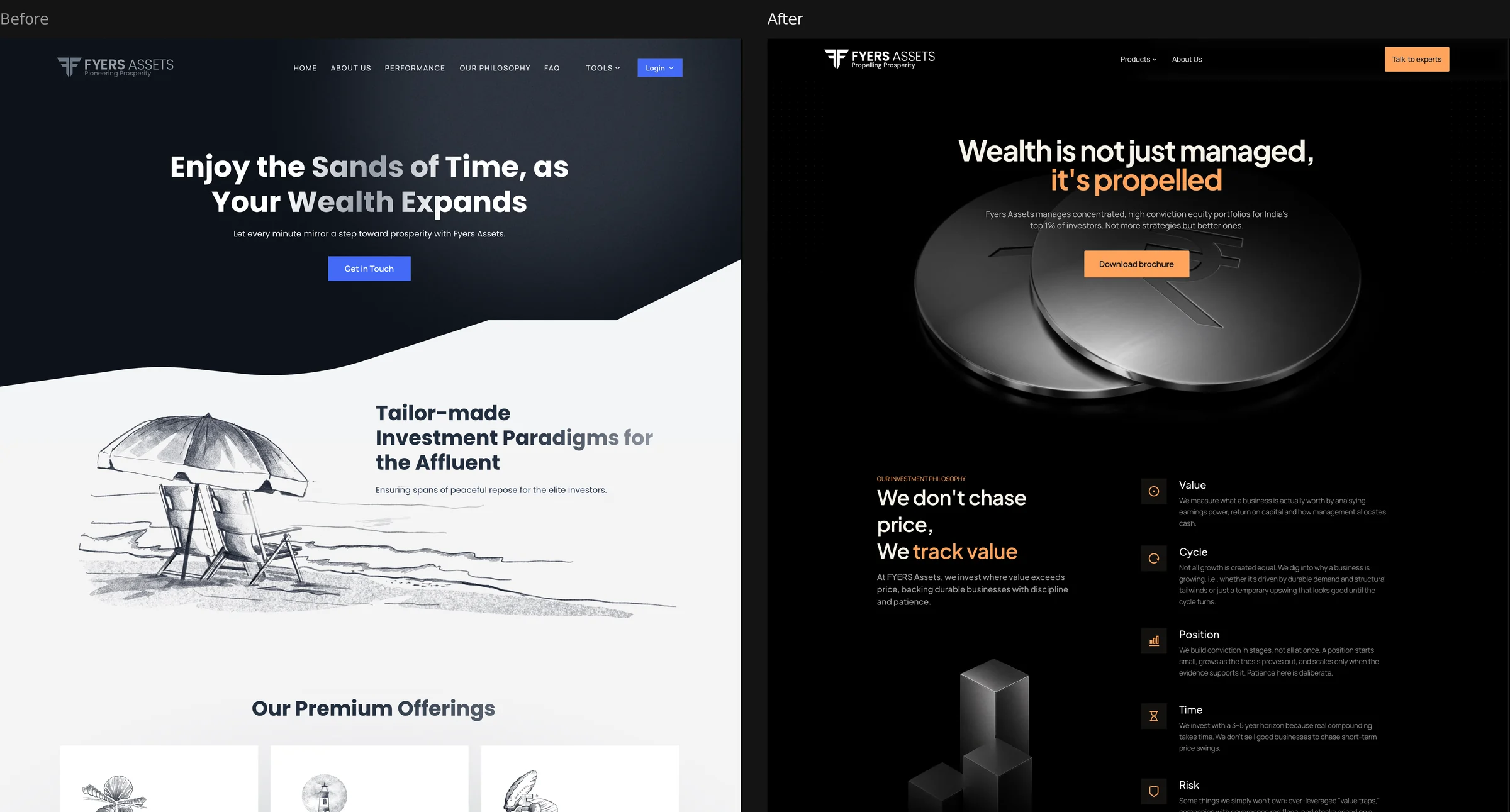
Both websites looked like the rest of Indian broking: bright blue, light sections and stock photos. Nothing said premium or serious.
One of two senior designers on a team of three, with a design manager, on the websites for both businesses. I also designed both design systems end to end.
Keep the logo, go dark-first and premium, and give each business its own character inside one family: precision for traders, craft for wealth.
Both sites went live in 2026, on fyers.in and fyersassets.in, with the ELITE and LEGACY design systems behind them.
FYERS is built for serious traders, but its websites didn't look it.
The FYERS Securities site had a bright blue bar, yellow highlights and a posed stock photo of two people with a laptop and a phone, then light grey sections with the same tiles and promises as every other broker in India. FYERS Asset Management, which runs portfolios for wealthy investors, had a navy site with sketched beach chairs and seashells under the line Enjoy the Sands of Time.
The brief had three parts: look different from India's other trading platforms, show that FYERS is for serious traders, and feel premium. The logo stayed exactly as it was. Everything around it changed.
We were a team of three: a design manager and two senior designers. I was one of the senior designers.
Together we redesigned the websites of both businesses, FYERS Securities (FSPL) and FYERS Asset Management (FAMPL). I also designed the two design systems end to end: ELITE for FYERS Securities and LEGACY for FYERS Asset Management, from the logo rules to the last component.
With the logo fixed, everything else had to carry the change.
Go dark-first on both sites, and make colour a signal: electric blue with yellow for emphasis on FYERS Securities, copper-orange on FYERS Asset Management.
One family, two characters: the same logo, structure and type on both sites, but sharp and precise for traders, and sculpted metallic 3D objects for wealth.
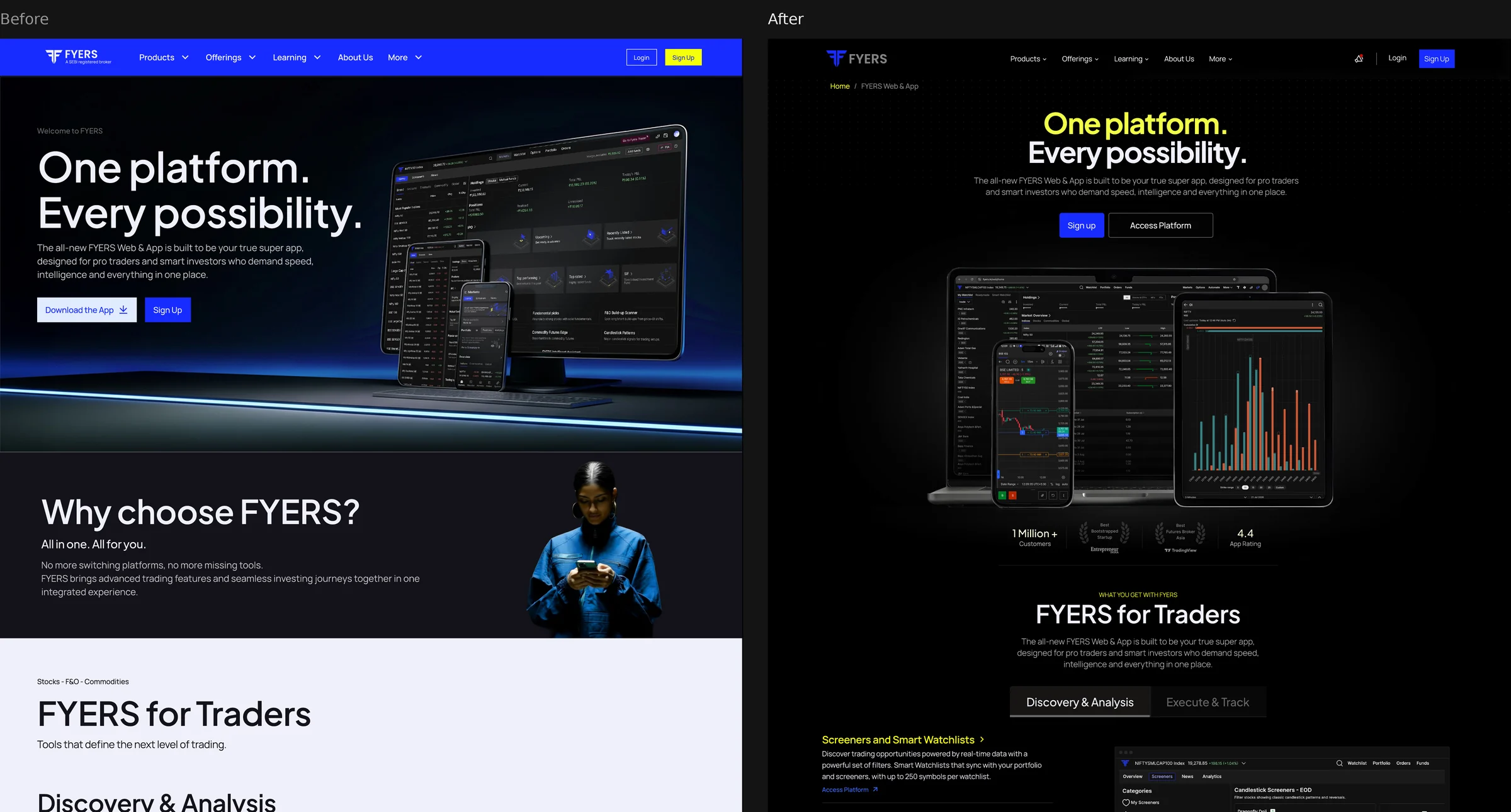
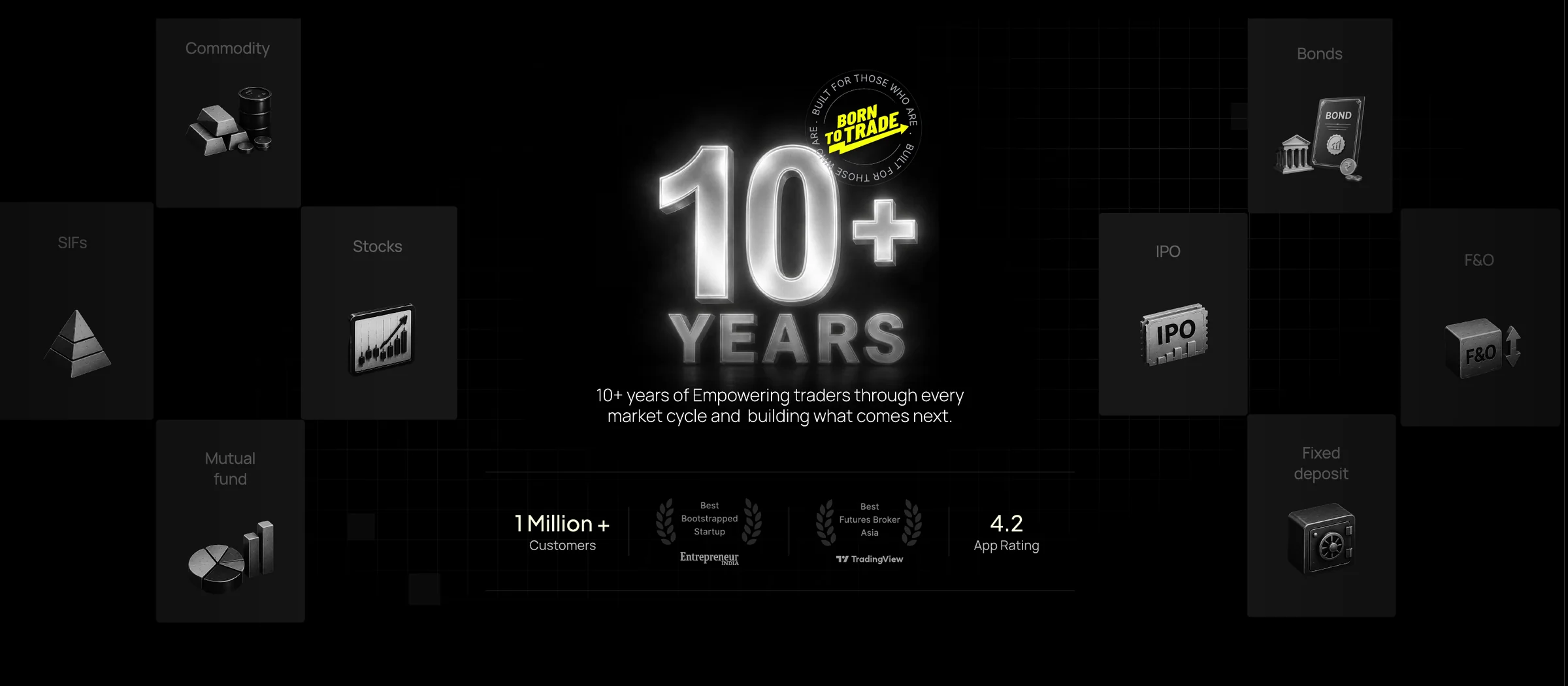
Replace stock photos with proof: real terminal screens, 10+ years, 1 million+ customers, awards and the app rating on FYERS Securities; the fee structure and each fund's minimum investment, up front, on FYERS Asset Management.
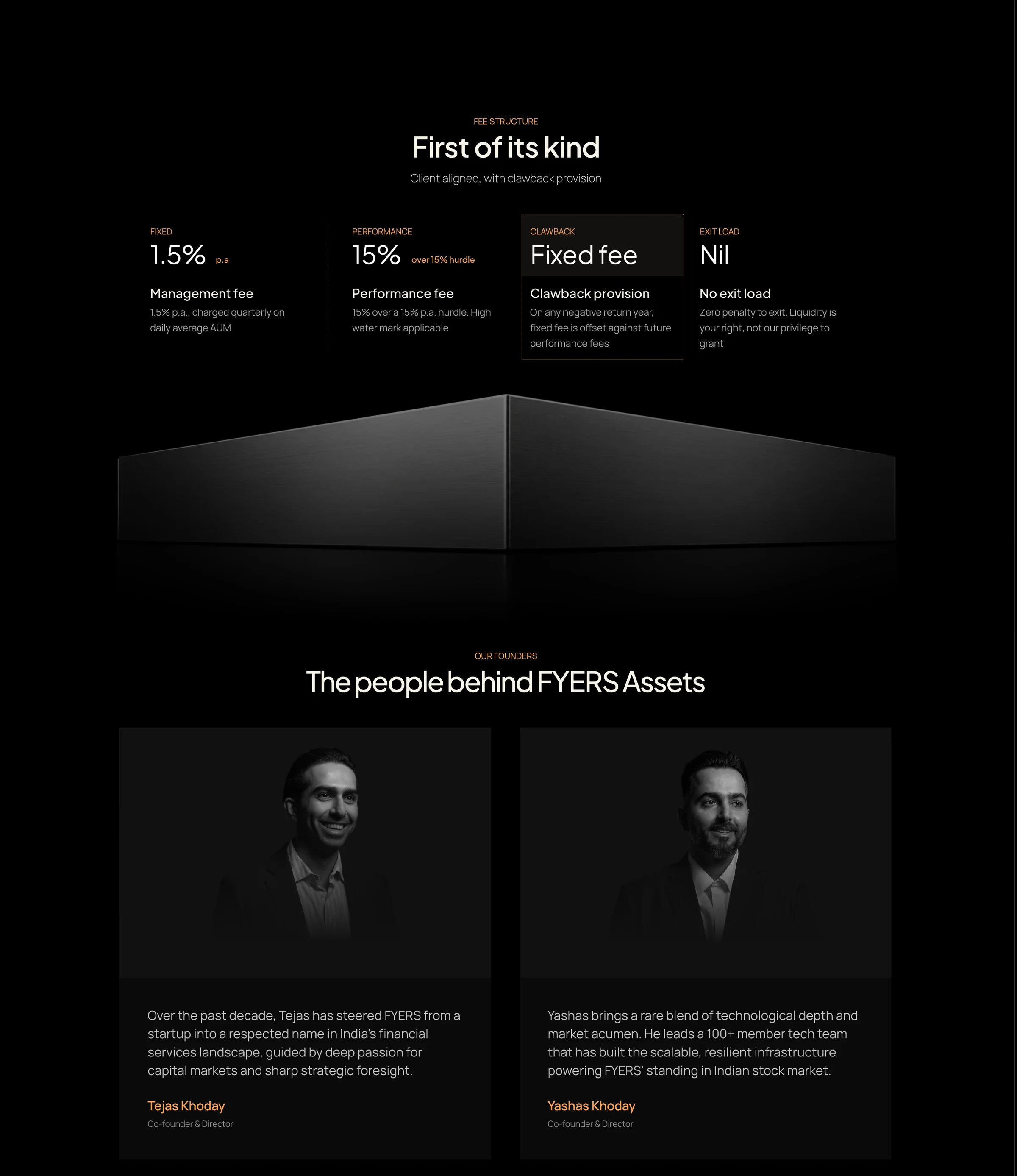
Show people in black and white: the founders, the CIO and the team.
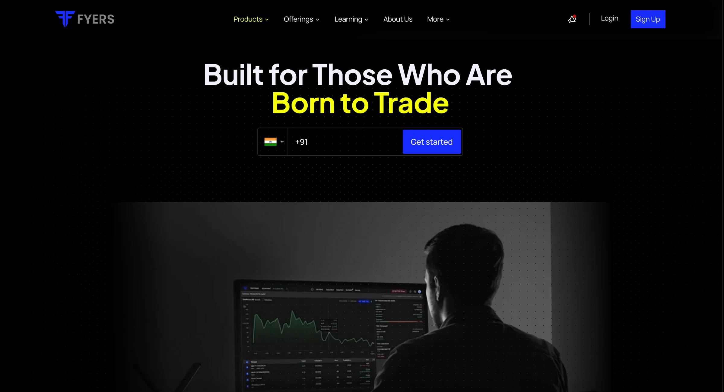
Give the voice an edge: Built for Those Who Are Born to Trade, the #BornToTrade seal and A million traders. One verdict. for traders; Wealth is not just managed, it's propelled for wealth.
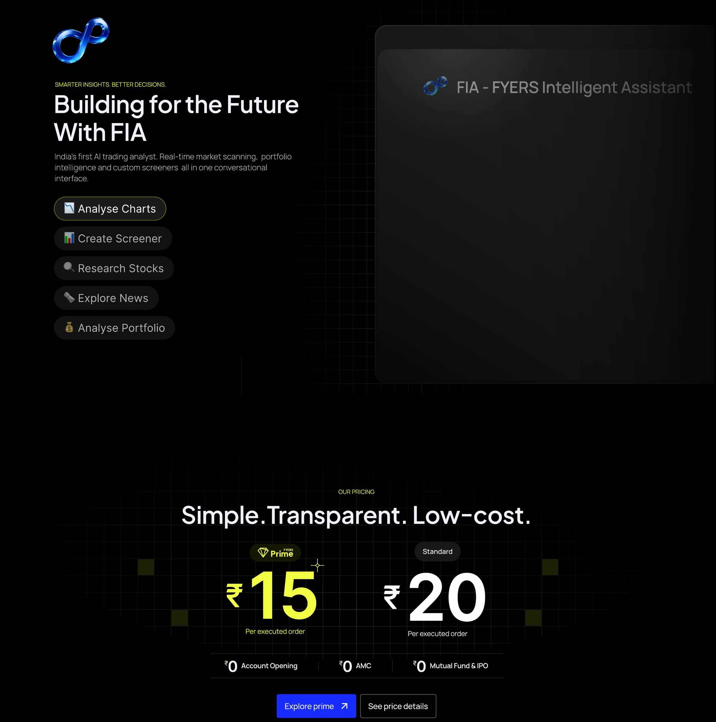
Write it all down as two design systems, which I designed end to end: ELITE (Where Precision Meets Excellence) for FYERS Securities, LEGACY (Where Wealth Meets Wisdom) for FYERS Asset Management.
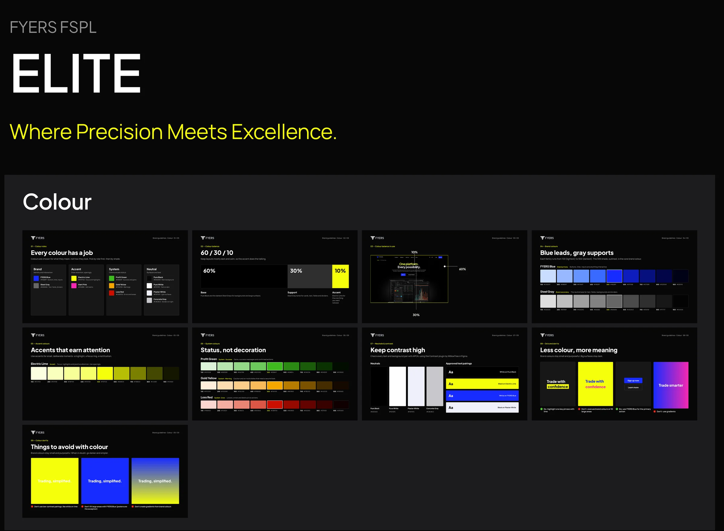
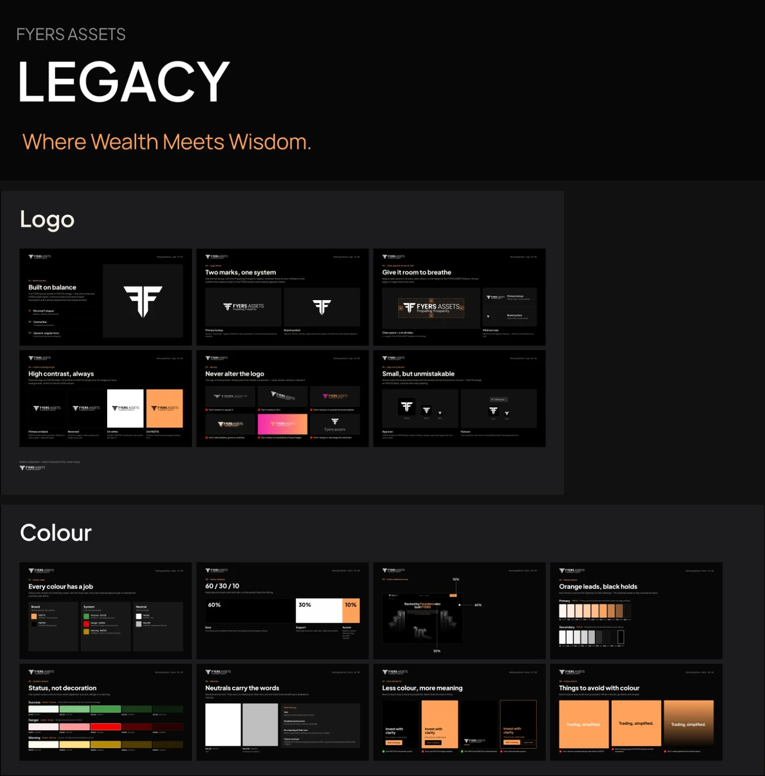
The design systems are what keep the rebrand from wearing off.
Every new page, ad, thumbnail or video starts from the same rules, so teams across FYERS can stay on brand without a designer checking each piece. LEGACY is built the same way as ELITE, so when FYERS Asset Management needs video, components or tables, they slot onto foundations that already exist.
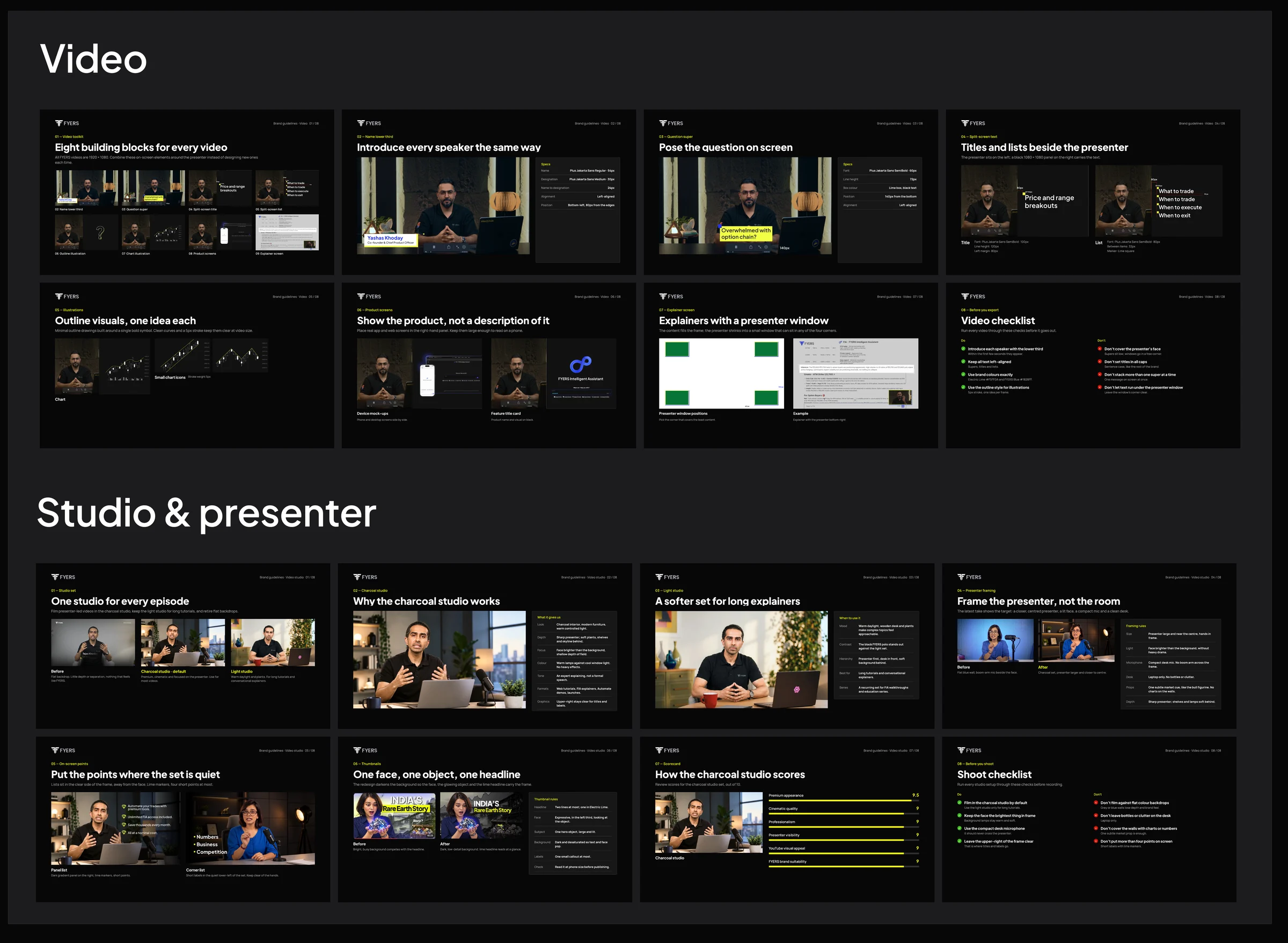
Both sites went live in 2026.
FYERS Securities now opens with Built for Those Who Are Born to Trade on black, and FYERS Asset Management with Wealth is not just managed, it's propelled. Both are live, so the best way to see the work is to scroll them.

- A rebrand is mostly restraint. Keeping the logo and using colour rarely made the change feel bigger, not smaller.
- Two audiences can share one family. A clear set of shared rules leaves room for each brand to sound like itself.
- Write the rules down. Without ELITE and LEGACY, the new look would last only as long as the people who drew it.