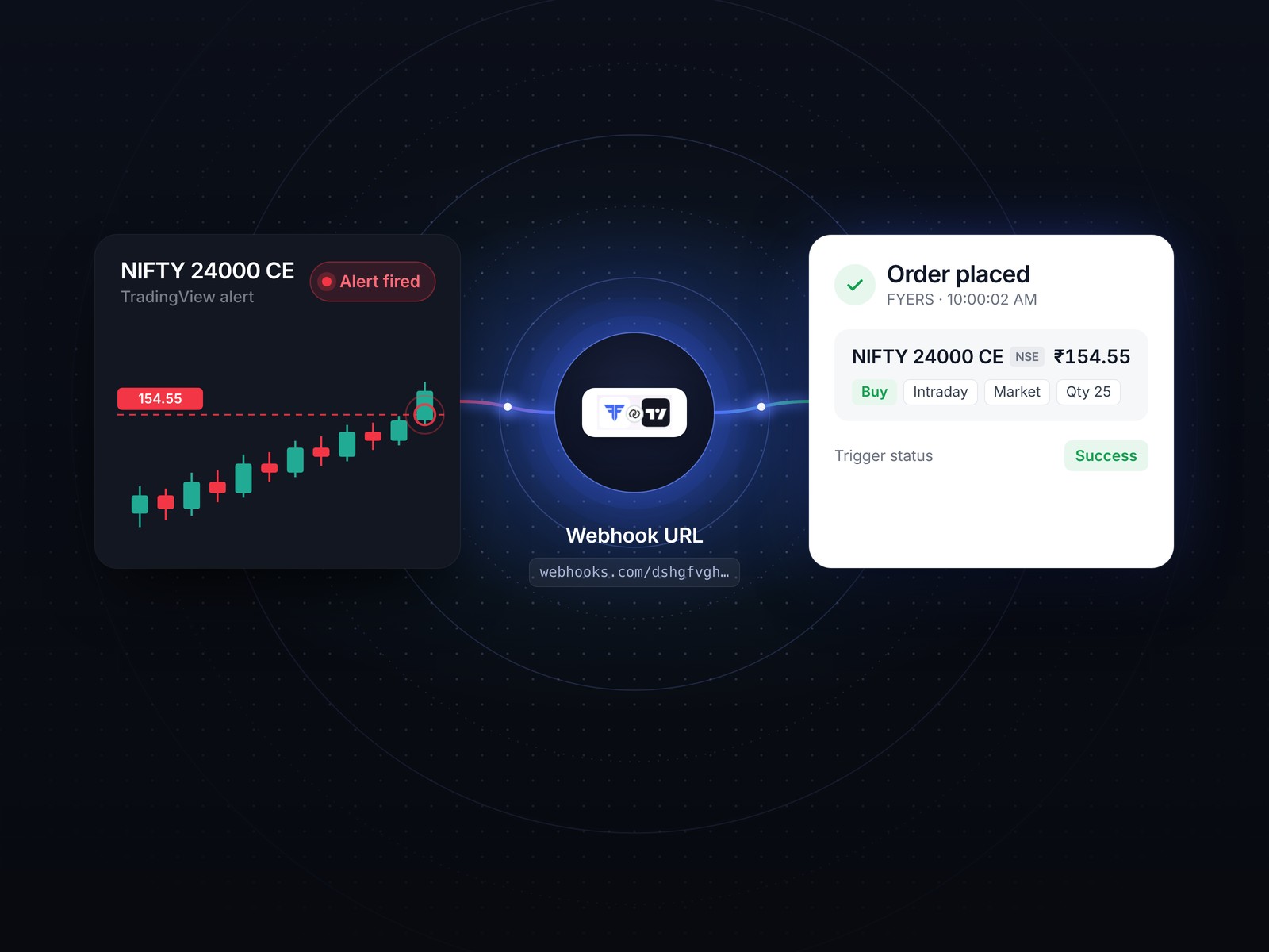
FYERS was built for traders, and its mutual funds sat outside the app on a separate web page. I designed mutual funds inside FYERS, on web and app, so investing works like the rest of the platform: the same frame, the same orders, the same way of comparing.
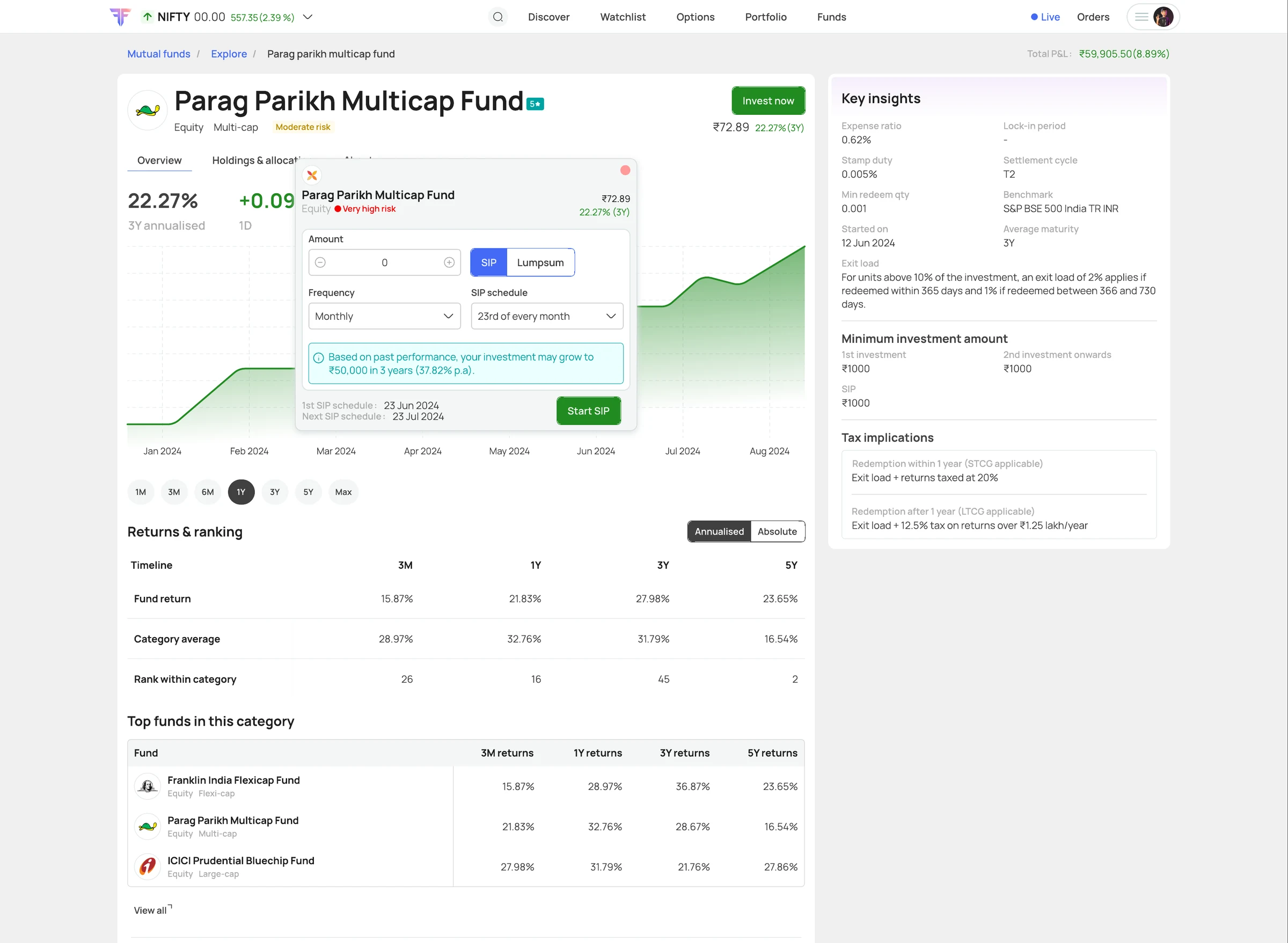
FYERS Direct, the old mutual fund platform, opened outside the app on a separate web page. Investing meant leaving FYERS.
I took the requirement from the product owner and designed mutual funds on web and app with them, over 2–3 months of back and forth and iterations.
Build mutual funds into FYERS itself: its frame, its orders, its way of comparing, plus a few things only a trading platform would offer.
Shipped in 2025 inside the FYERS app and web, alongside equity, IPOs and everything else.
FYERS is built for people who trade. Someone who came to invest had nowhere in the app to go.
Mutual funds did exist, as FYERS Direct, but tapping it took you out of the app to a separate web page. It looked and worked like another product, so investing felt like leaving FYERS rather than using it.
Traders noticed. In October 2024 one asked in the FYERS community for a proper mutual funds experience, with a clearer dashboard and SIP and one-time options on each fund's page. The brief for this project was short: make mutual funds feel like part of FYERS, like every other product on it.
The requirement came to me from the product owner, and I carried the design with them, on web and app.
It took 2–3 months. There was a lot of back and forth with the product owner and stakeholders, and many rounds of iteration on the designs before they settled.
Most of the work was deciding what to borrow from FYERS, and what to add only because this is FYERS.
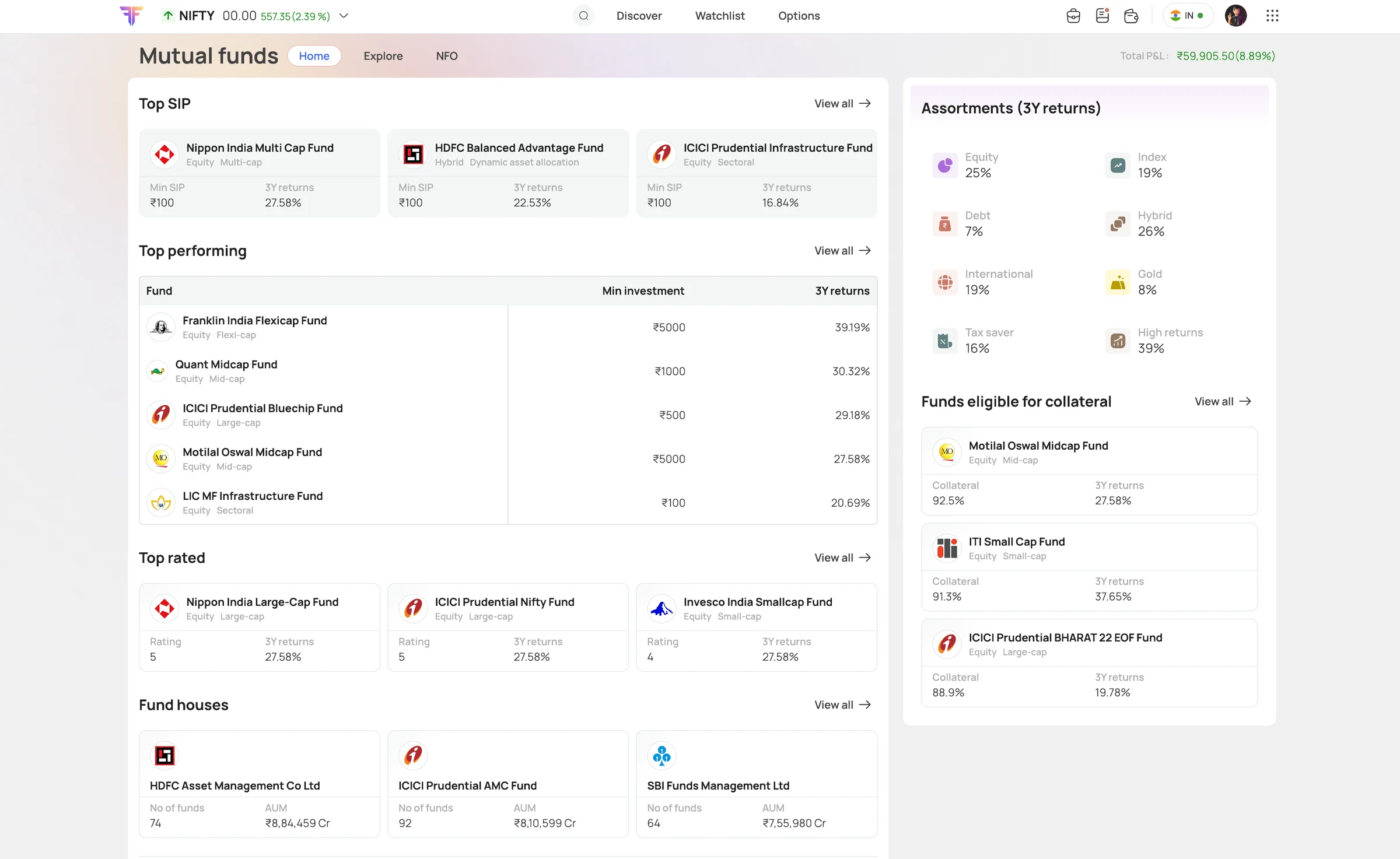
Put mutual funds inside FYERS's own frame: the same top bar and total P&L, Home, Explore and NFO as tabs, and mutual funds as a tab in Orders next to Equity & derivatives and IPO.
Give pledging a place on the home page and in Explore: funds eligible for collateral, with how much each counts for, and a Pledge to trade filter.
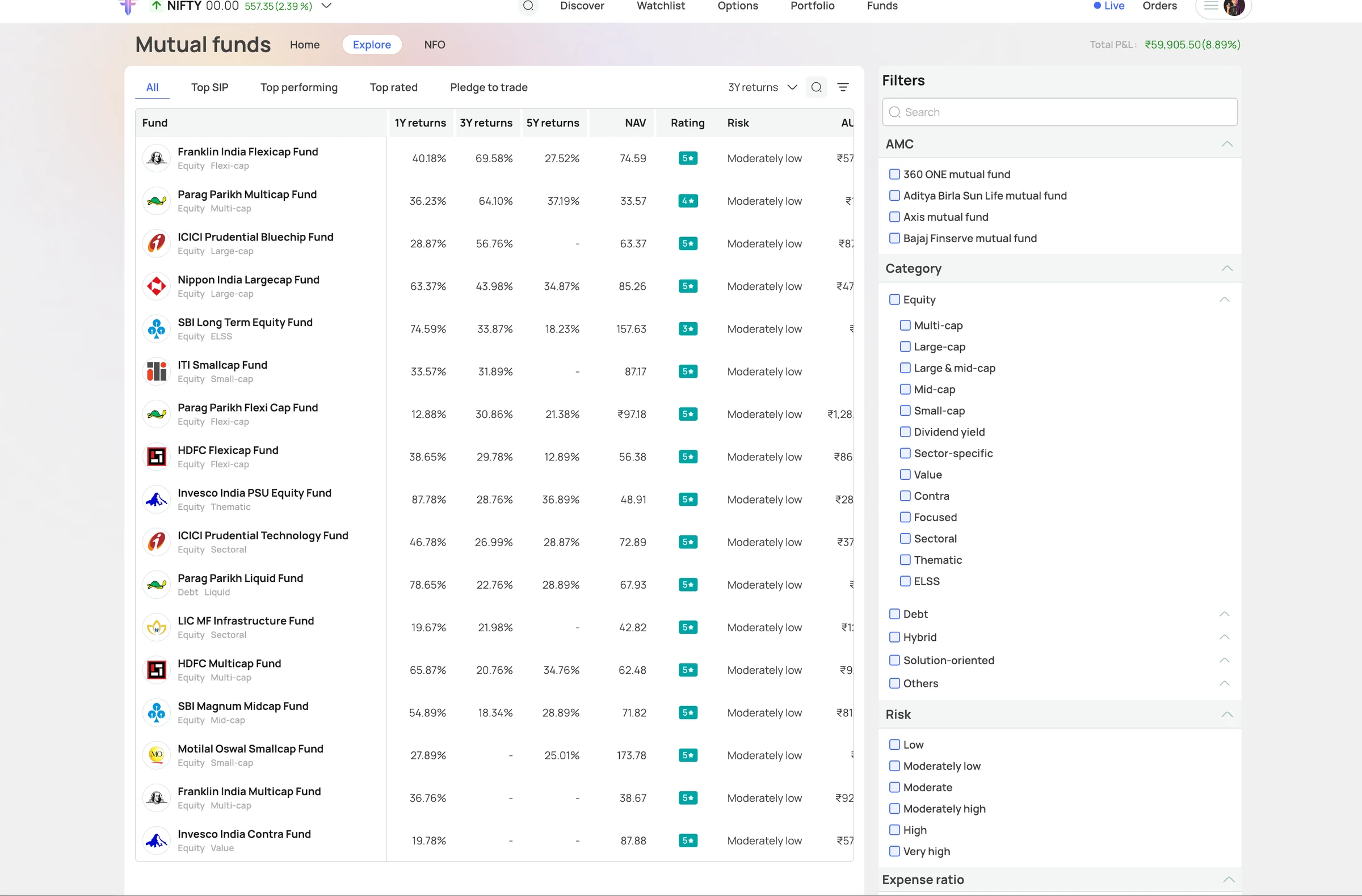
Make Explore a screener: one table of returns, NAV, rating and risk, with filters for fund house, category, risk and expense ratio.
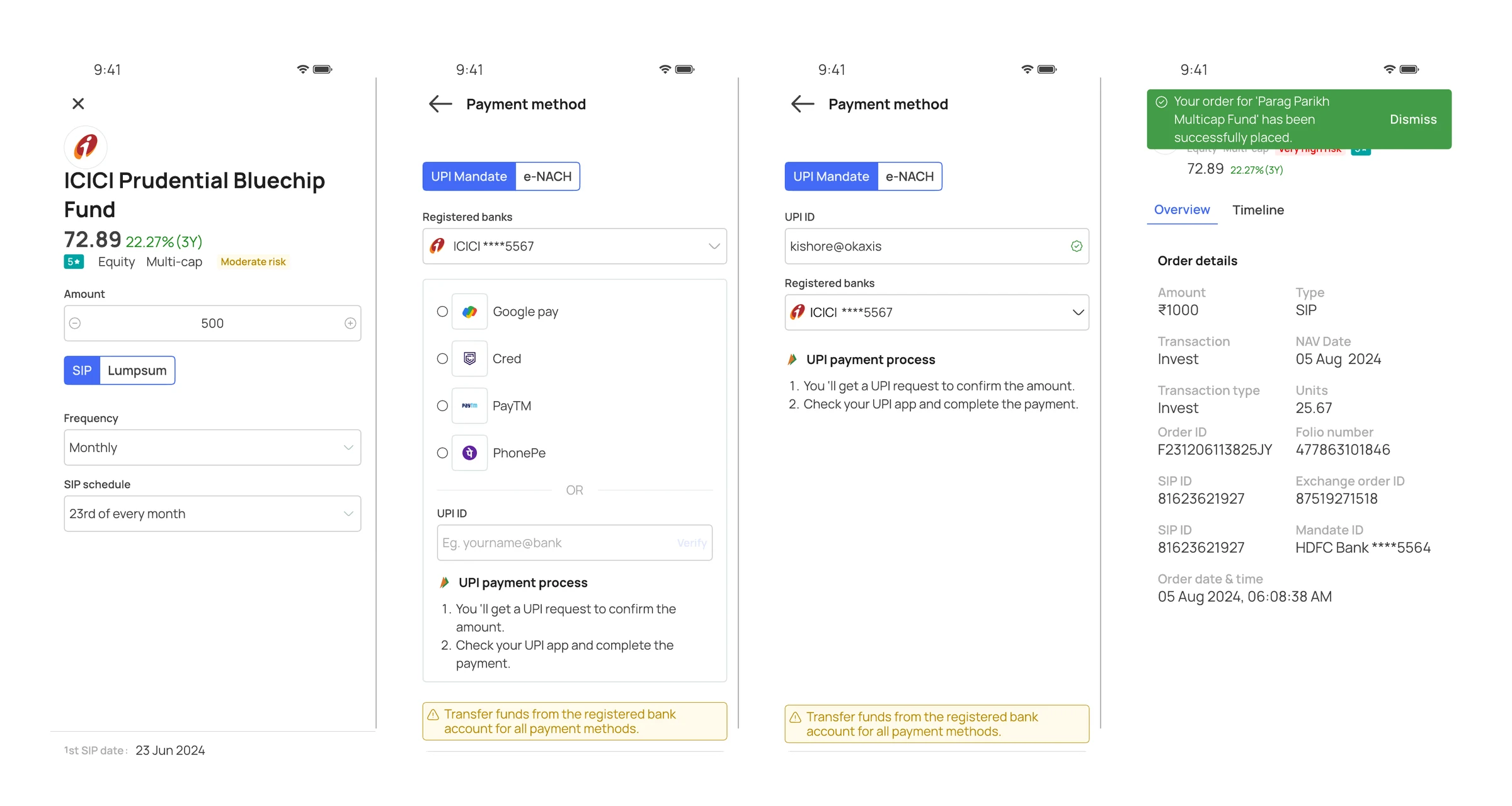
Invest from the fund page: an order window over the fund (a full screen on the phone) with SIP or lump sum, amount, frequency and SIP date, and the first and next SIP dates shown before you start.
Make payment explicit: UPI mandate or e-NACH, the registered bank shown, a plain note that money must come from it, and a timer to approve the request.
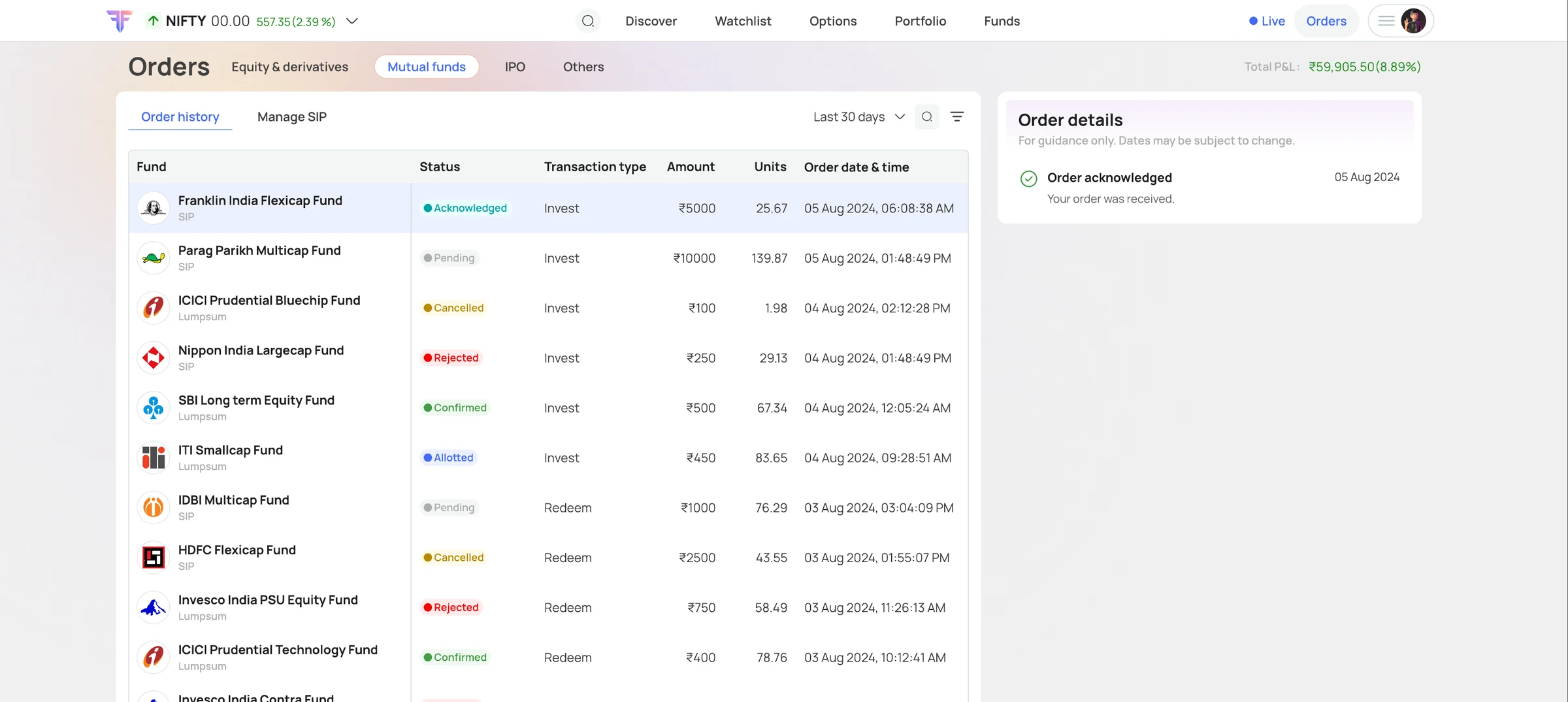
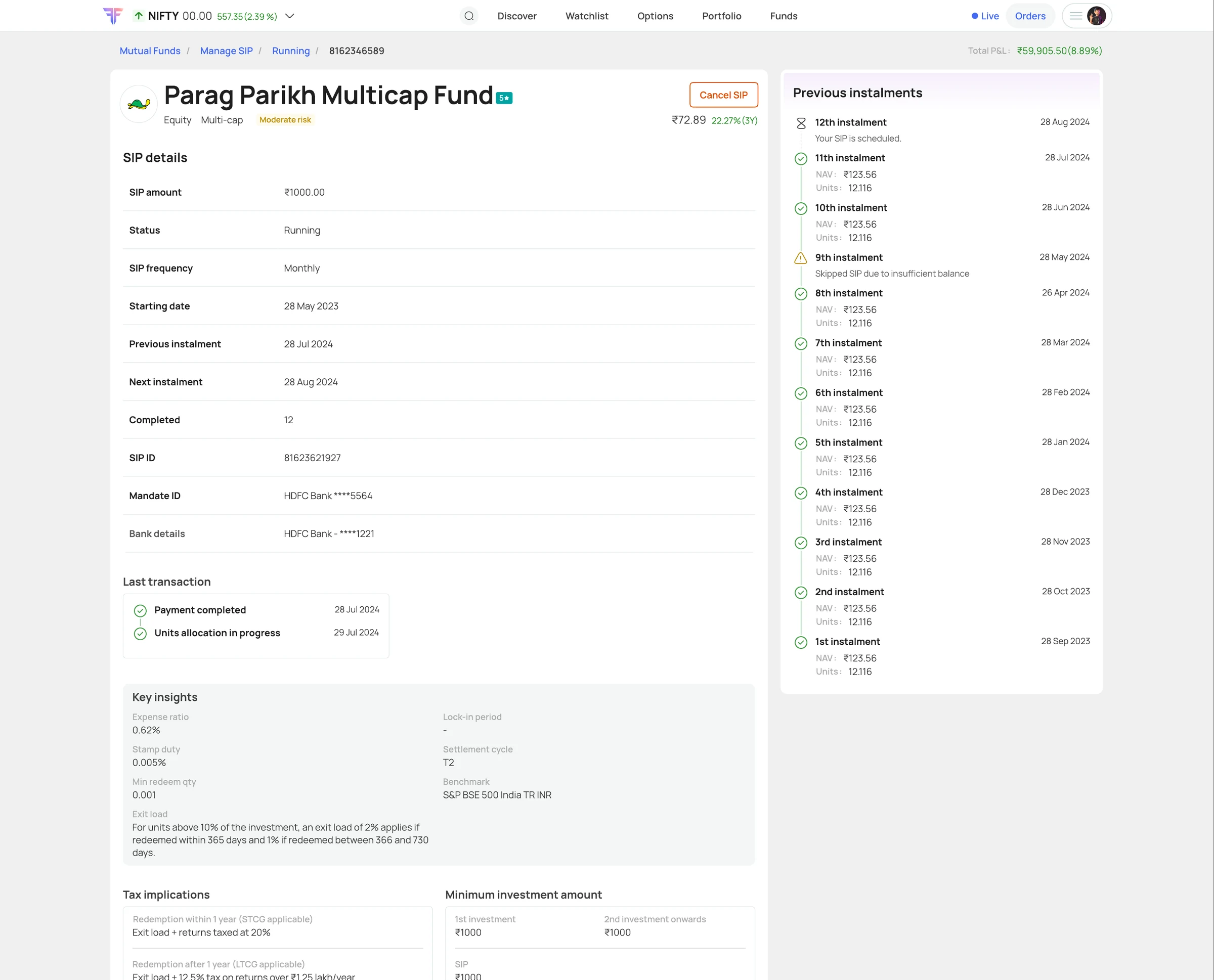
Give every order and instalment a status: acknowledged, pending, confirmed, allotted, cancelled or rejected in Orders, and each SIP instalment with its date, NAV and units, including a skipped one and why.
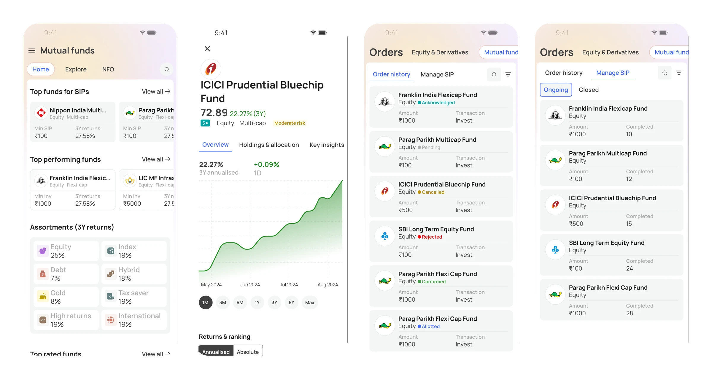
Keep the same tool on the phone: shelves, fund pages, orders and SIPs as cards, with the same tabs as the web.
One late change shows how the design held up: the fund manager.
The first fund page assumed one manager per fund. Real scheme data showed that many funds are run by two or more. Because the manager section was its own block, built from the same fund cards used everywhere else, the fix stayed inside it: one manager shows as a single profile, several show as a list you can move between, each with the other funds they run. Nothing else on the page had to change.
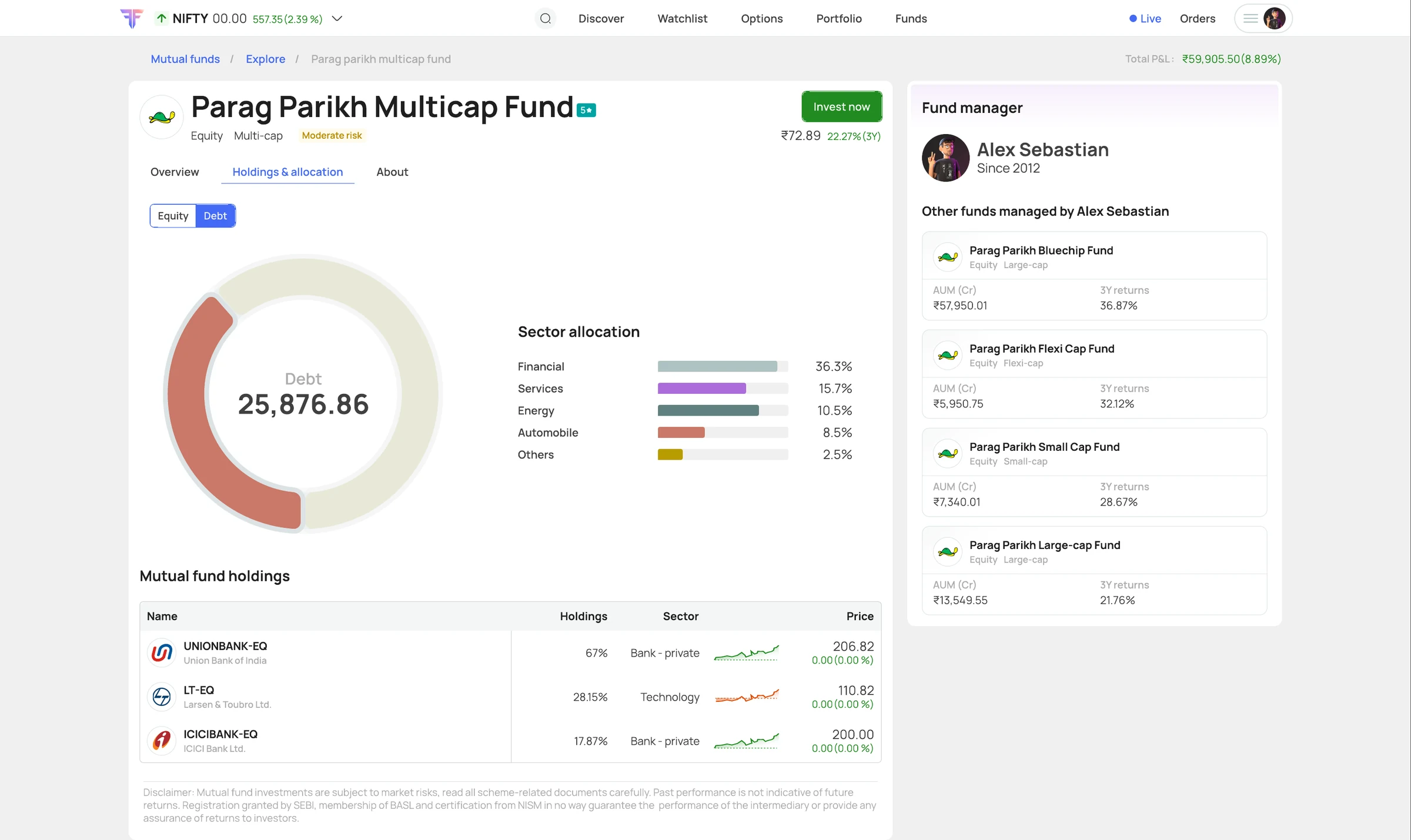
Mutual funds shipped in 2025, inside the FYERS app and web, not as a separate product.
FYERS's help centre now says there is no separate mutual fund app: you invest in direct funds by SIP or one-time order in the main app, and manage SIPs under Orders, next to everything else. Someone who comes to invest can start on FYERS without leaving it, and a trader sees their funds in the same place as their trades.
- Consistency is a feature. Using FYERS's own frame meant fewer new things to learn, for the people using it and for the team building it.
- Design for the platform's people, not the category. Pledging and a screener-style Explore are there because FYERS users are traders. A generic mutual fund app would never lead with them.
- The back and forth is part of the work. Two to three months with the product owner and stakeholders turned a list of features into decisions everyone could stand behind.