A working prototype of an app that helps a family get a patient home after cashless hospital treatment. I used AI to map the system, design every outcome, then build and film the prototype.
Can one app on the family’s phone shorten cashless discharge, when the hospital, TPA and insurer each hold part of the claim?
Problem framing, system mapping, UX and visual design, and directing AI to build, animate and film the prototype.
Map the system, design every outcome with its real reason, then build a working prototype and refine it screen by screen.
A clickable prototype with five scenarios and 23 mapped outcomes. Next, I want to test it with families and hospital desks.
A patient is cleared to go home, then waits for hours while the hospital, TPA and insurer pass paperwork back and forth. The family sees none of it.
India’s insurance regulator asks insurers to give final cashless approval within three hours of getting the bill. Families still wait far longer, because much of the delay happens before that clock starts, and nobody tells them who is holding things up. I wanted to see how far one app on the family’s phone could close that gap, without waiting for hospitals or insurers to connect their systems.
Cleared at 9:40 AM.
Home at 3:40 PM.
I mapped who holds what at each stage, then every way a stay can go.
A service blueprint across six stages, from booking to leaving, showed where time is lost: a late pre-authorisation, missing papers, a top-up asked for too late, and queries nobody owns. I then listed 23 outcomes, from approval in full to a disputed deduction, and gave each one its real reason, who has to act and what the family can do next.
One claim, four parties, six stages
{{p.num}}{{p.name}}
- 23
- outcomes mapped, each with a reason and an owner
- 4
- sources the app trusts for a reason
- 0
- hospital or insurer integrations needed
I worked with Claude as a design partner and builder. I set the direction and the bar, it drafted, and I reviewed every screen.
The app never guesses a reason.
Without hospital or insurer integration, the app only shows what it can trace: the policy, the insurer’s letters and what the desk reports. Anything else says Reason not known yet and gives the family the exact question to ask.
Some moments feel less certain than a family would like, until hospitals and insurers share status directly.
From there I worked in short loops: a layout led by reference screens, then motion (a sliding tab pill, icons that draw themselves, slide to send), then the hierarchy of every card. The film was assembled in HyperFrames for the app launch and Remotion for the cut.
Every problem gets a way out
A working prototype that runs end to end across five scenarios, from a smooth planned surgery to a clock that runs out.
Home, claim, money
Try Cleared yourself
Take a family through a planned knee replacement: check the policy, answer an insurer query, pick a room, chase the desk and pay the final bill.
- Designing the failure states first made the happy path simpler. Once every outcome had an owner and a reason, the home screen only had to answer two questions: who has it now, and what can I do?
- An honest “reason not known yet” earns more trust than a confident guess.
- AI sped up building and filming, but the judgement stayed mine: what to show, what to leave out, and when a screen was too loud.
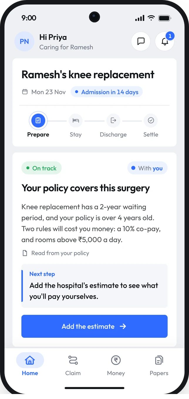
Take Cleared for a spin
A working build of the app, with a fictional patient, hospital and insurer.
- 5 scenarios
- 3 minutes
- Nothing is sent
- Move through the storyTap the numbered steps beside the phone, from the policy check to discharge day.
- Use it like a real appTabs, cards, sheets and slide-to-send all work. Every number updates as the stay goes on.
- See what goes wrongSwitch the scenario to see an insurer query, a room above the cap or a clock that runs out.